Hooray! Scope time!!!
Of late, I’ve whinged many times about the lousy weather
we’ve had over the last few months. This
latest stretch really has been just terrible.
If not overcast, then too hot, or seeing has been miserable.
Earlier this week I did manage some time with a scope with a
mate who came by with a couple of new scopes (a couple of lovely refractors)
and some eyepieces. We had a great time
putting his scopes and eyepieces through their paces, and using his eyepieces
in a Newtonian of mine for comparison.
Seeing was not great, but we managed some good testing of his gear with
our combined experience. No sooner did
we call it quits, clouds rolled in, spelling the end of a potential Moon sketch
for that evening… <sigh>
This Sunday morning was surprisingly clear, and the Moon was
pretty much at zenith (straight overhead).
At 9:30 in the morning, the Sun is well up, and the sky a brilliant
bright blue. While the Moon looks lovely
and bright up in this bright blue sky to the naked eye, through a telescope,
the Moon is a very low contrast object, and only a low power proposition. Yet, the blue and white composition really
appealed to me! Knowing that I had sky
blue paper, I decided that the Moon was fair game today, and the low contrast
challenge made it all the more appealing to me as I haven’t undertaken such a
sketch before – yep, I’m a weirdo… LOL!
So, I set up my ED80
First thing to decide on was the optimal magnification. Very low, the contrast is improved, but the
details are too fine. High magnification,
the contrast is too low to make out any details. So for the first time I used my Baader zoom
eyepiece. The zoom feature makes it much
easier to figure out the best magnification to use. So, today, 20mm was just right.
Not have experienced such a low contrast situation before, I
was on new ground to work out how to go about this. Colour selection of the soft pastels was the
first. Black was out straight away as it
is just too strong and not actually what’s seen through the eyepiece. I have a blue soft pastel, but it was too
intense and not the right hue. So, from
what I had at hand, I decided to use white and the grey soft pastels. The grey, while also too dark neat, it would
be easier to tone down by going over it with the white. And a little experimentation as I go along is
also in the mix.
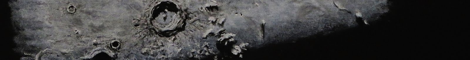
The image through the eyepiece was beautiful. The leading edge being so bright and
sharp. The terminator faded into the blue
of the sky gradually. The maria,
mountain ranges and craters varied so softly in shades of pale blue that it
made keeping track of the feature I was laying down difficult.
This was not a sketch with which to lay down the most
intricate of details. I became aware
that the piece would best resemble an Impressionist work, with only the gross
details identifiable, and finer details hinted at with the texture of the paper
and the way the soft pastel is handled.
After an hour I was done.
It became too difficult to pull out and follow the fine details as the
low contrast was becoming too difficult to negotiate. Only then did I examine the overall piece –
and I surprised myself! Soft pastel
being what it is, depending on the angle that the piece is examined the
brilliance of the paper is toned down, and the soft pastel begins to glow.
I hope you enjoy this piece as much as I do myself.
Alex.
Object: “Low contrast
Moon”
Scope: ED80 f/7.5
Gear: Baader zoom @
20mm, 33X
Date: 22nd January, 2017
Location: Sydney,
Australia


No comments:
Post a Comment